App Design
Weee!
toolbox
Employer
My Role
When
Live Site
Sayweee.comOVERVIEW - Weee!
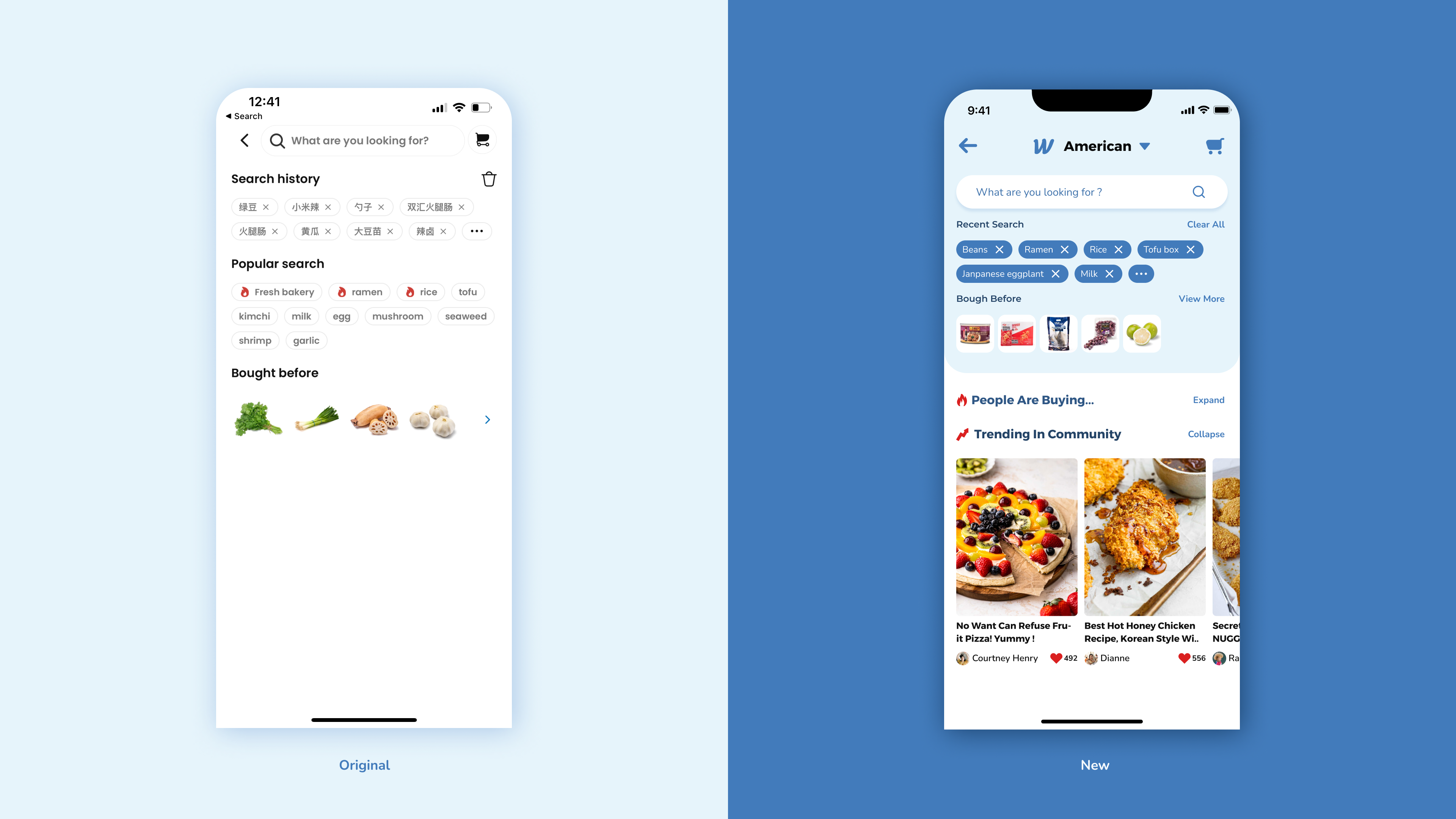
Weee! is the leading Asian and Hispanic e-grocer in the U.S., delivering more than 10,000 locally sourced and hard-to-find goods from around the globe directly to customers. In this project, you will see how I redesign their "search" screen from UI & UX aspects.
UX&UI Designer
- Enhanced the UX strategy and workflow
- Created wireframes, prototypes, and high-fidelity visual designs.
- Ensured that the product's visual design was aesthetically pleasing and usable.
- Developed and maintained a visual design system in figma.
Tool
Peers
Duration
Status
Results & Impact
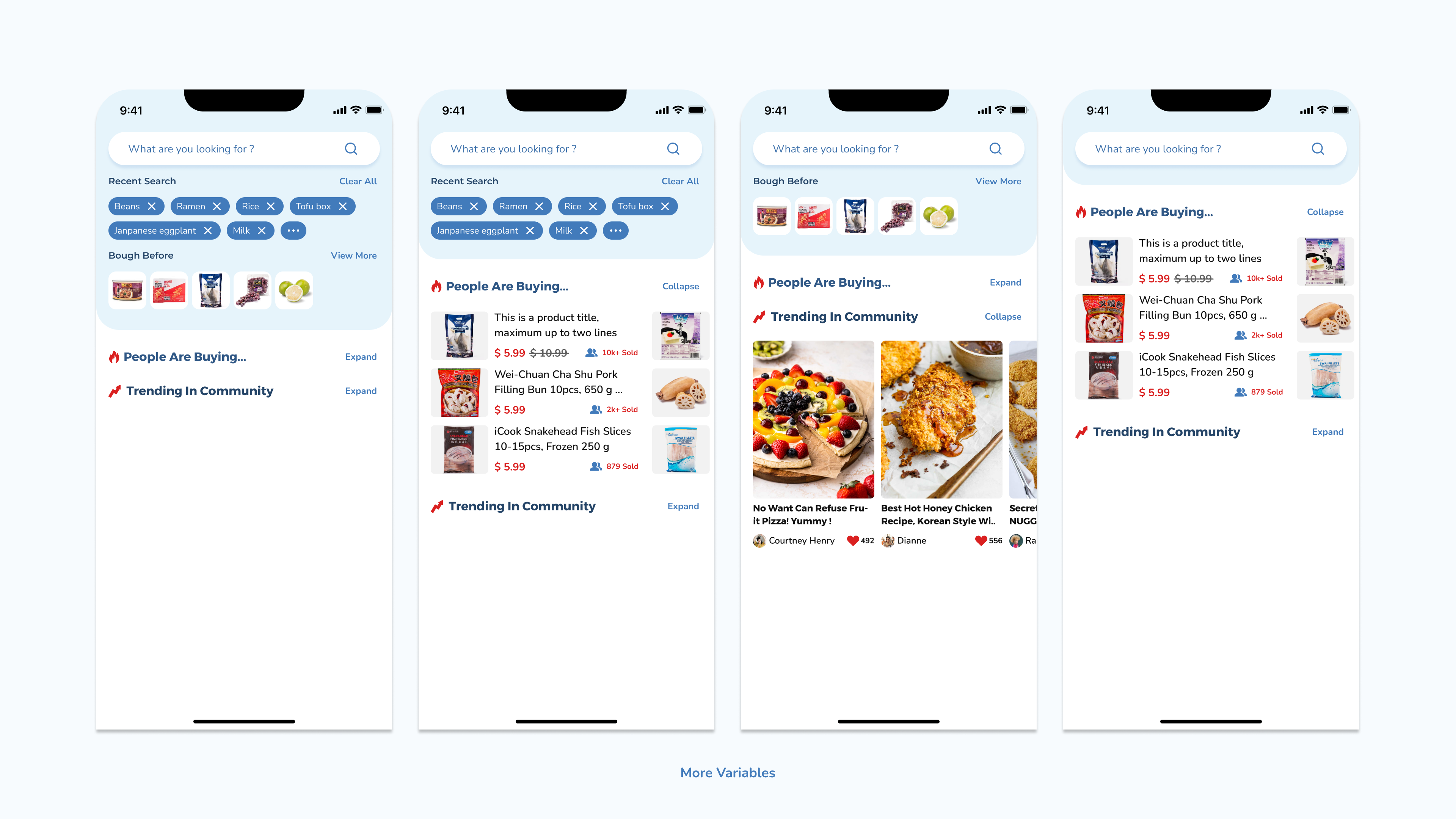
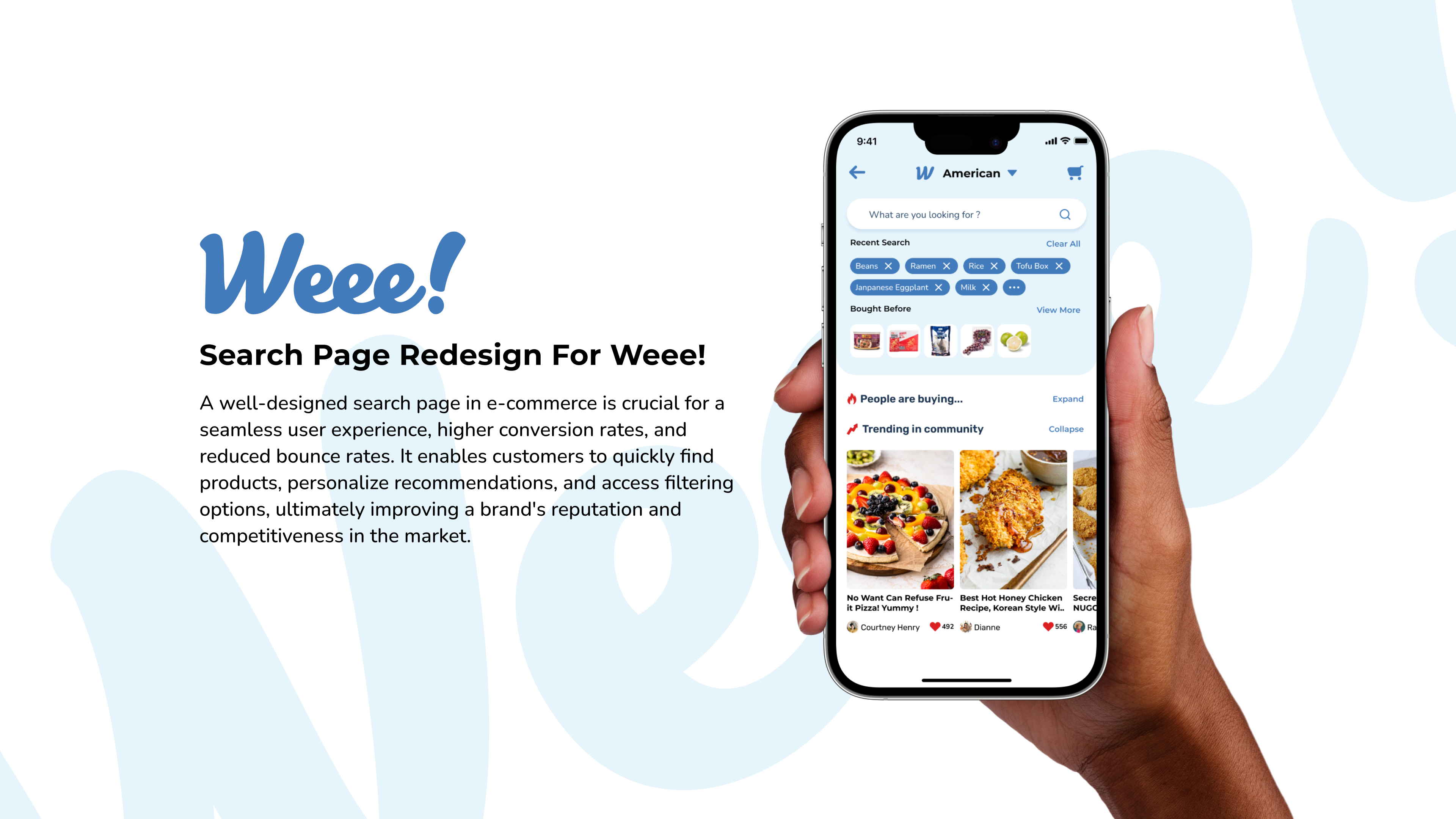
A well-designed search page in e-commerce is crucial for a seamless user experience, higher conversion rates, and reduced bounce rates. It enables customers to quickly find products, personalize recommendations, and access filtering options, ultimately improving a brand's reputation and competitiveness in the market.
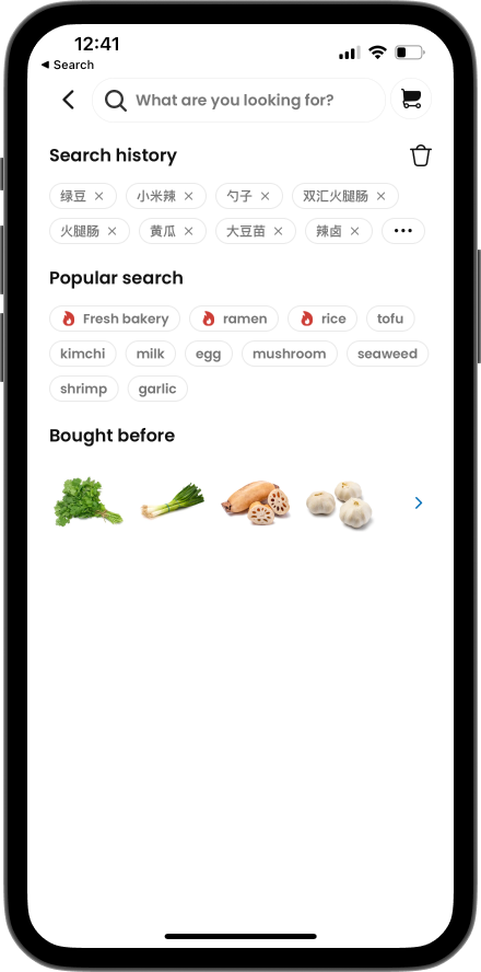
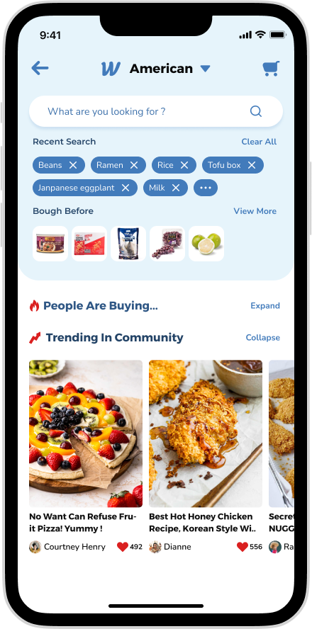
(Await the updates)
(Await the updates)
(Await the updates)
(Await the updates)
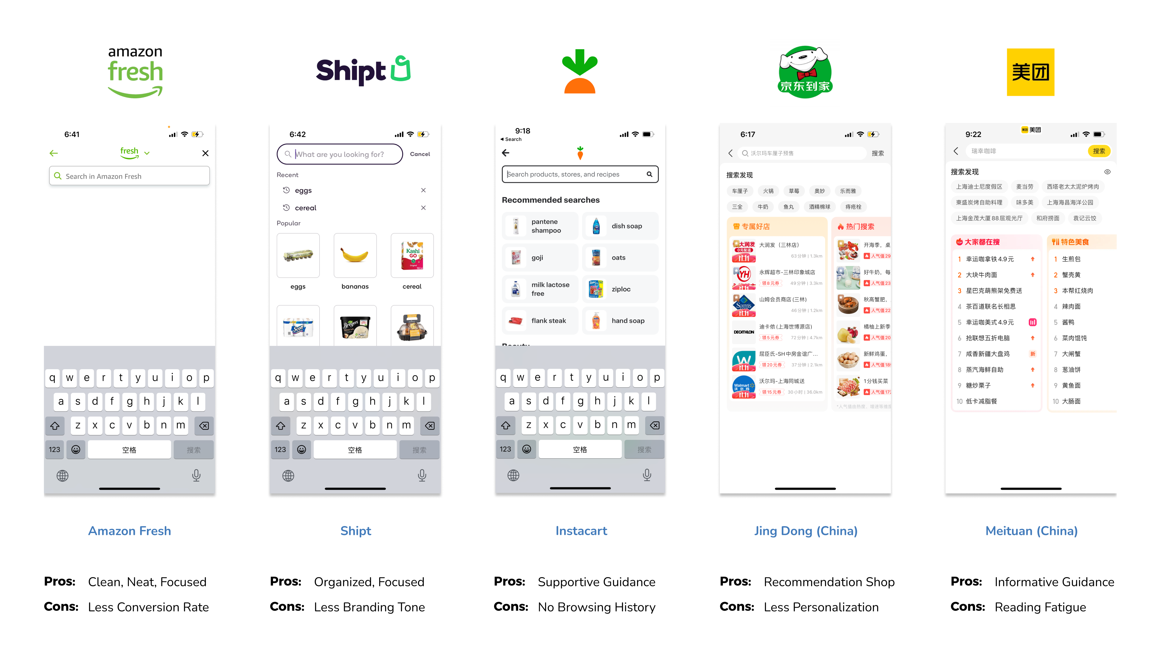
Learn from competitors
Learning from competitors is crucial in app design to understand market trends, user expectations, and potential pitfalls. It allows for innovation, differentiation, and the identification of market gaps, enabling the creation of a more informed, user-centric, and competitive app.
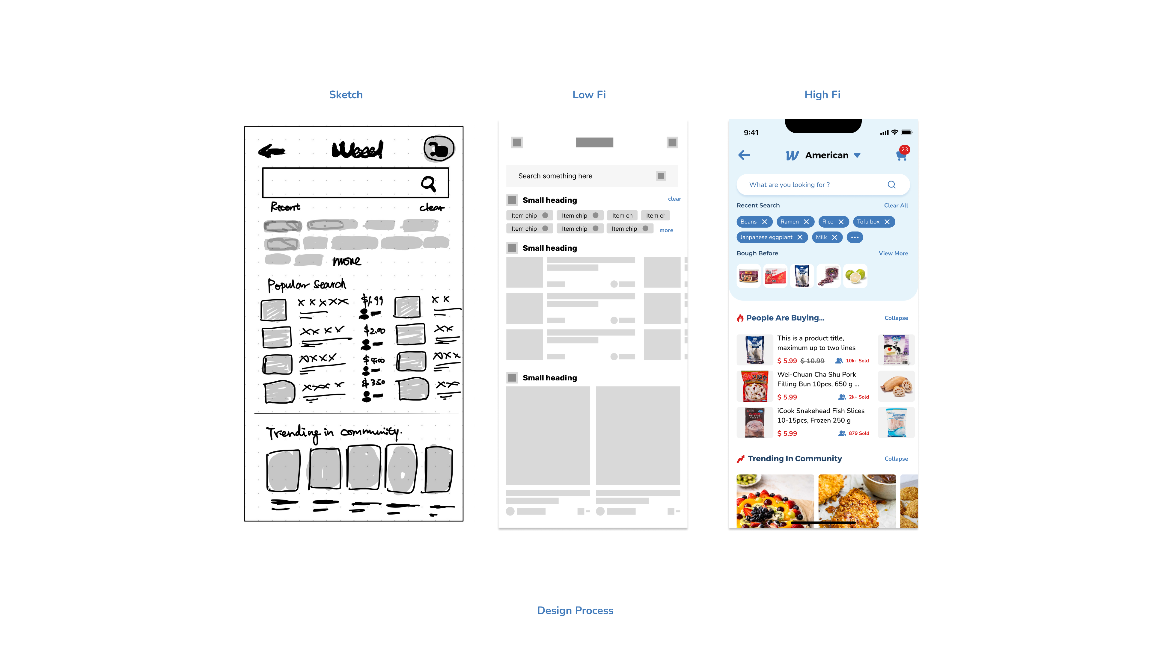
Design process
This progression from sketch to low-fi to high-fi facilitates a gradual refinement of the app design, ensuring that ideas are thoroughly explored and refined at each stage before moving on to the next.
UX ANATOMY
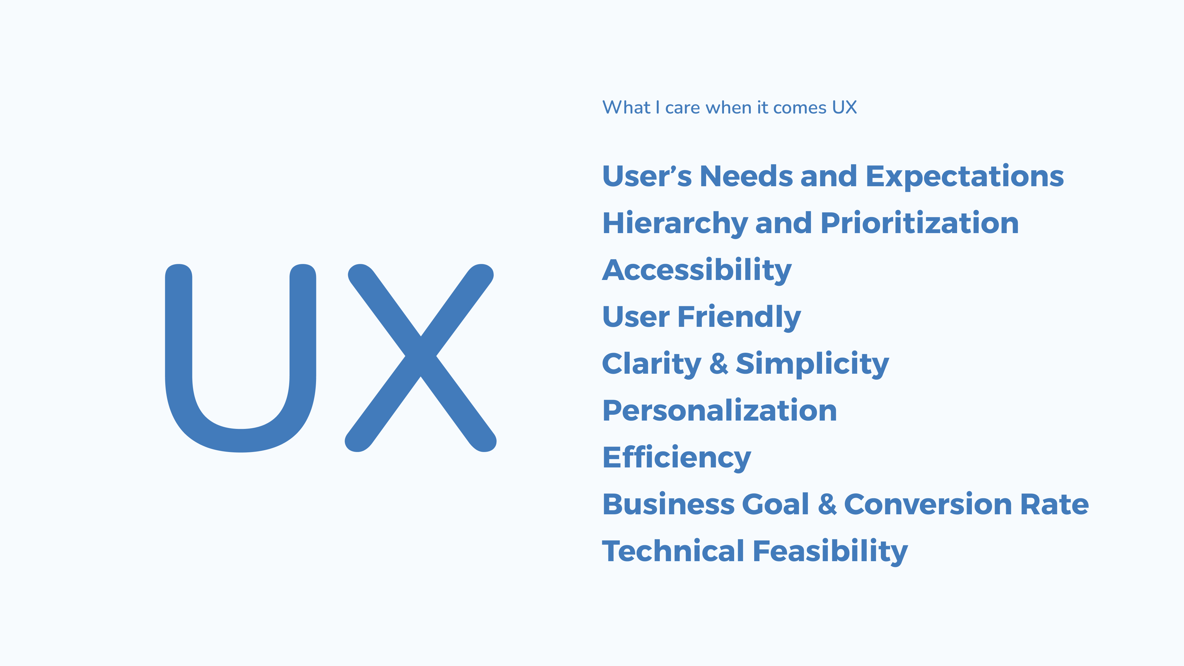
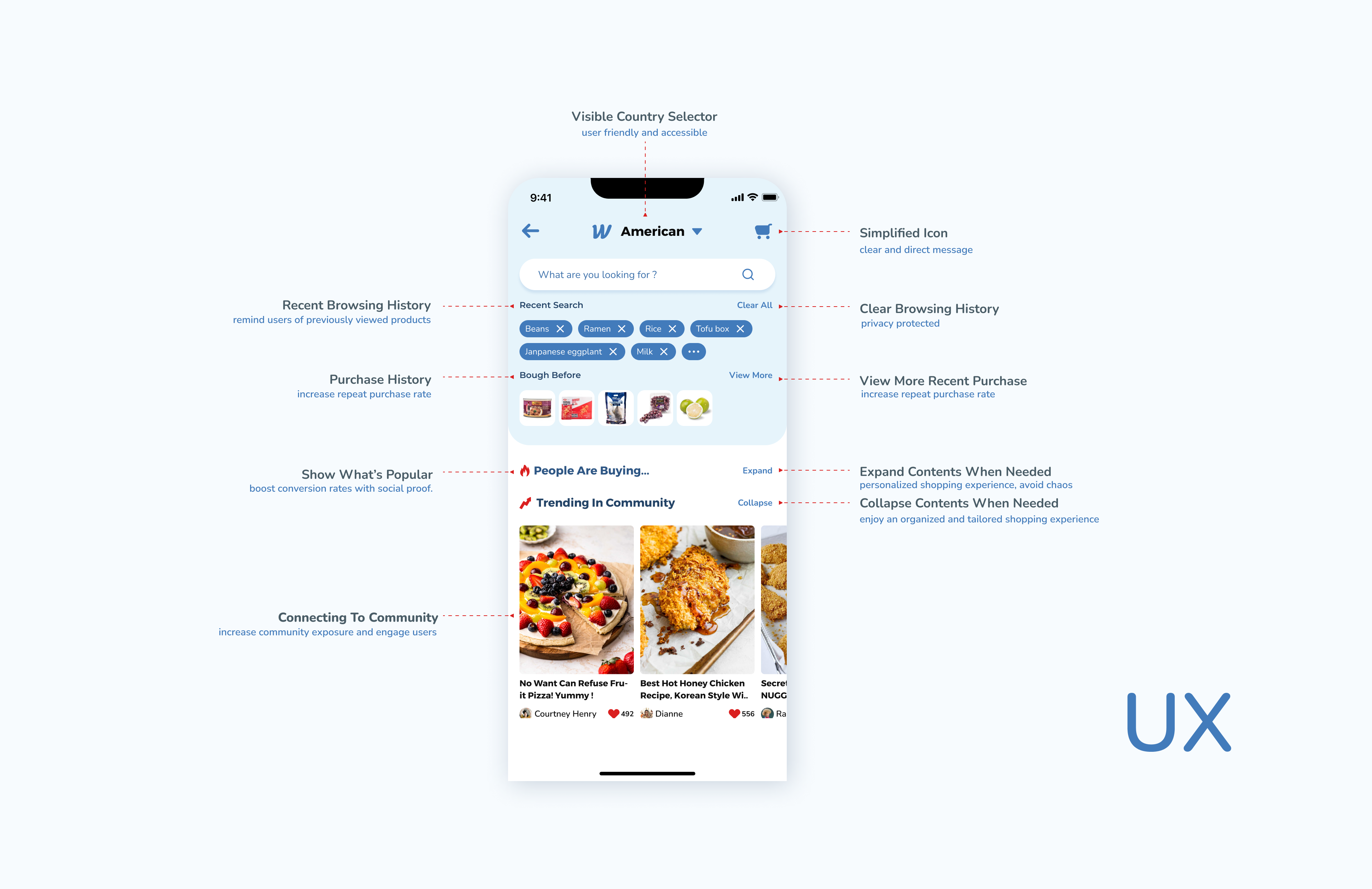
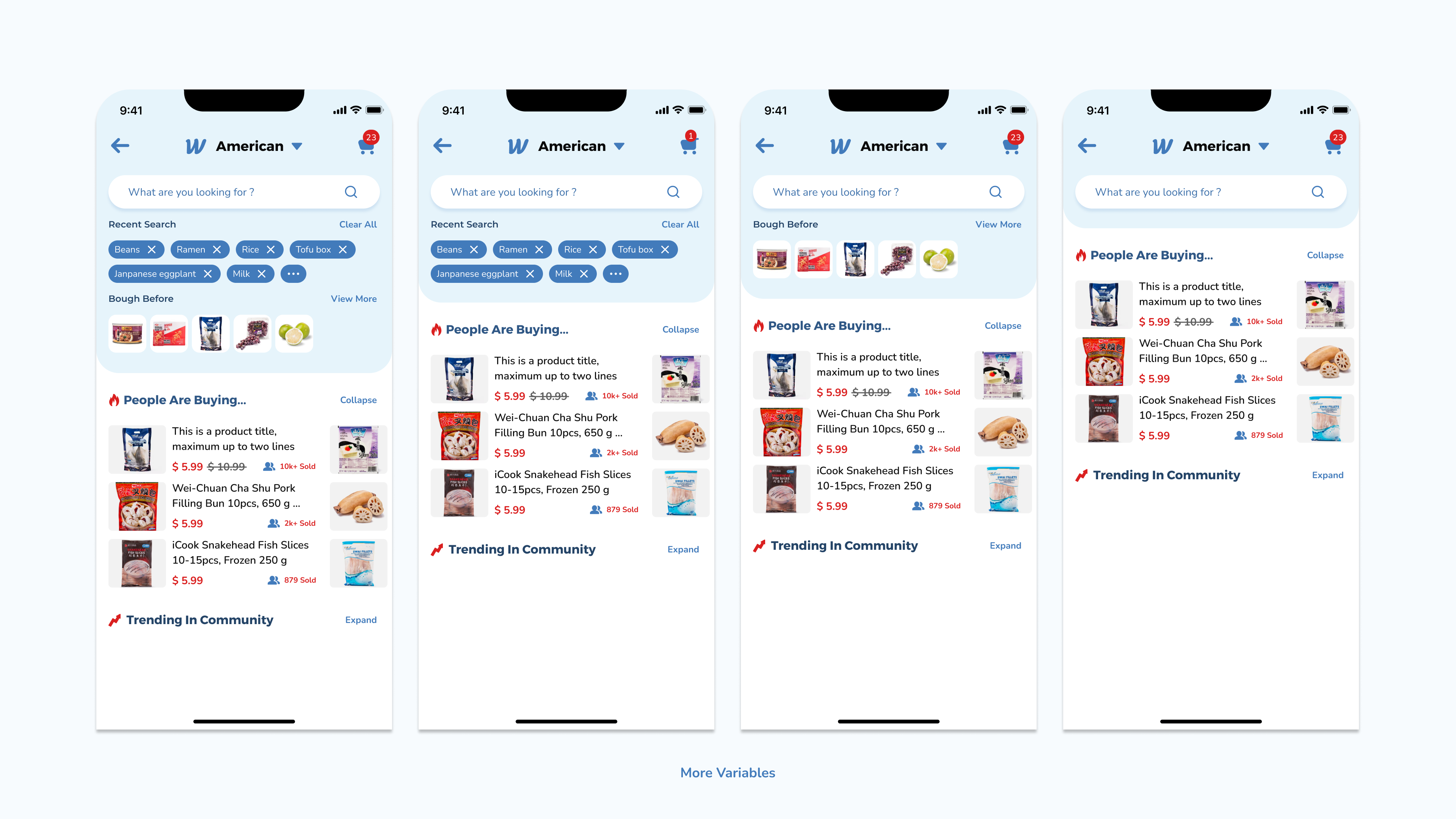
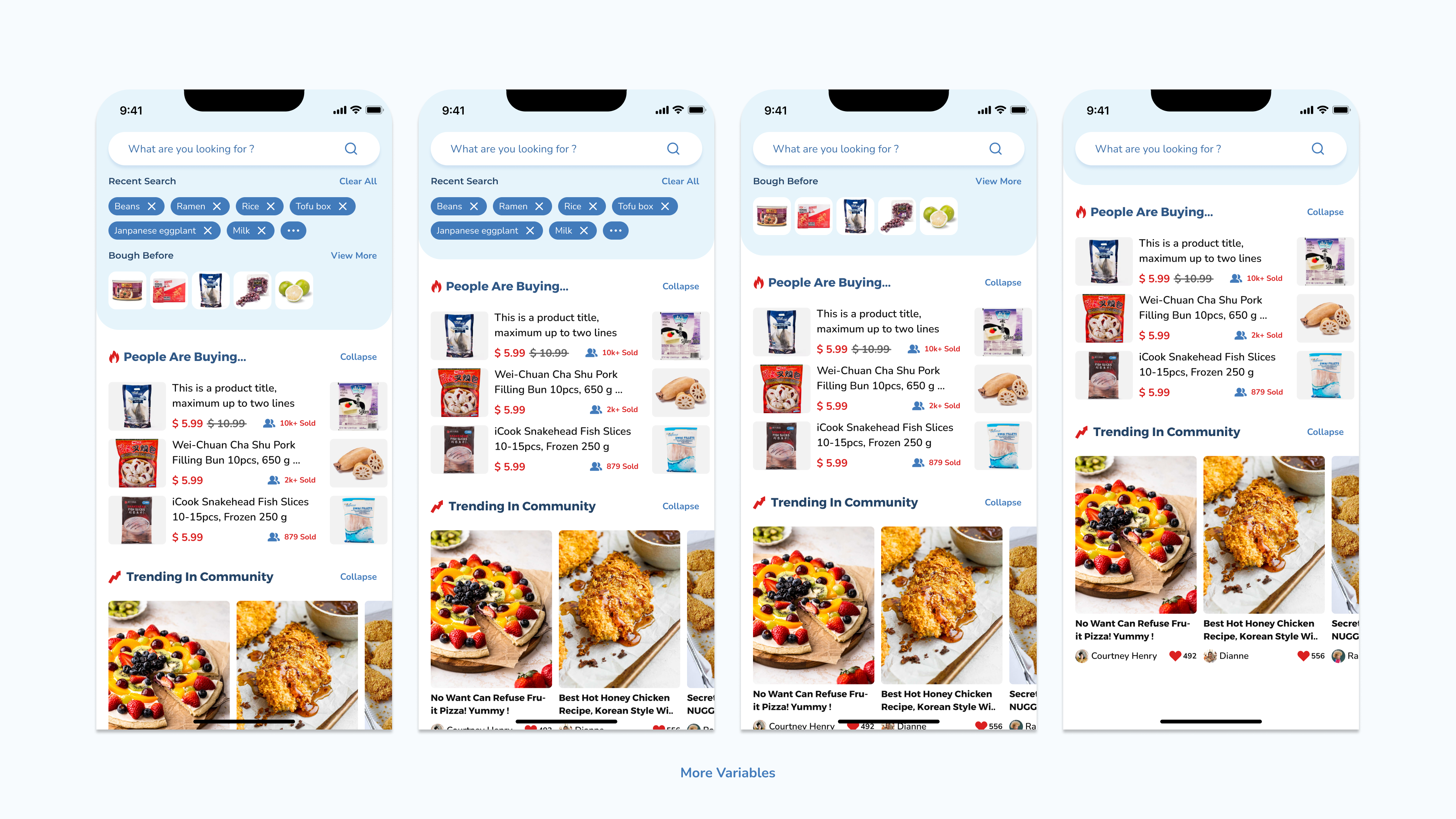
For UX design, I aim to meet users' needs by prioritizing important elements and ensuring accessibility. I emphasize user-friendliness, clarity, and efficiency to create a smooth and personalized experience. Aligning with business goals and ensuring technical feasibility are also crucial to our design process.
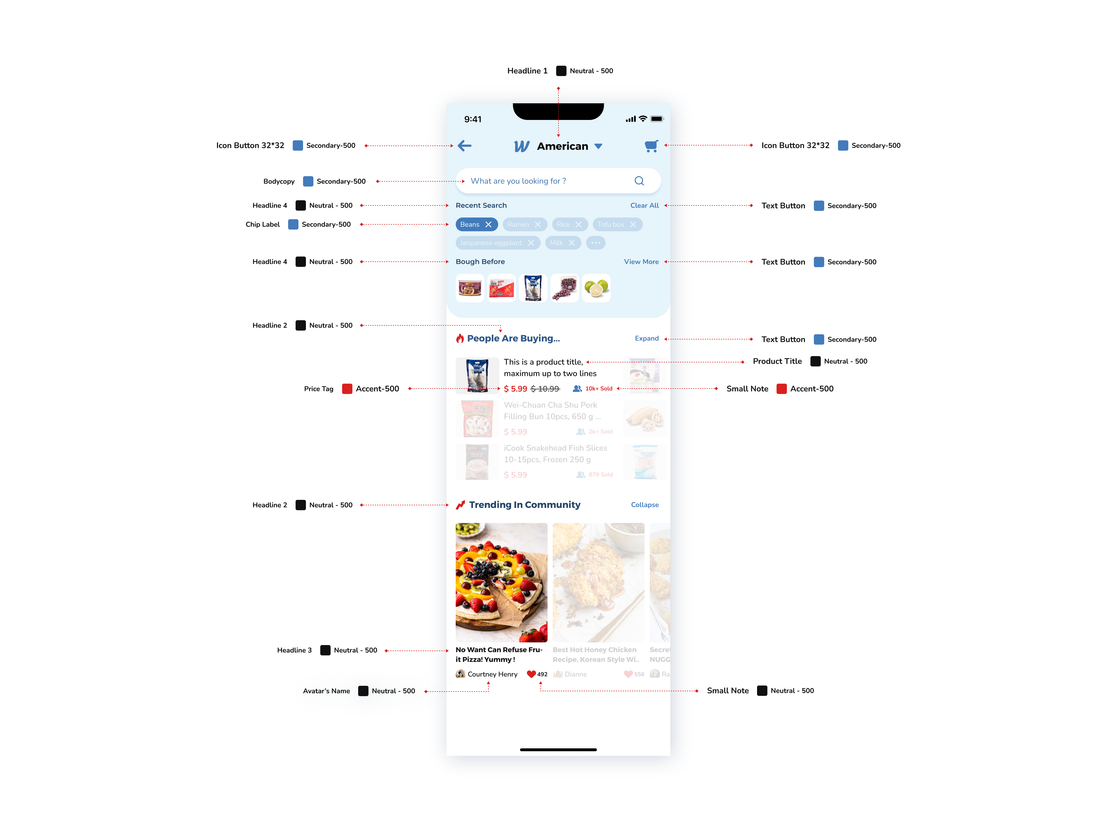
UI ANATOMY
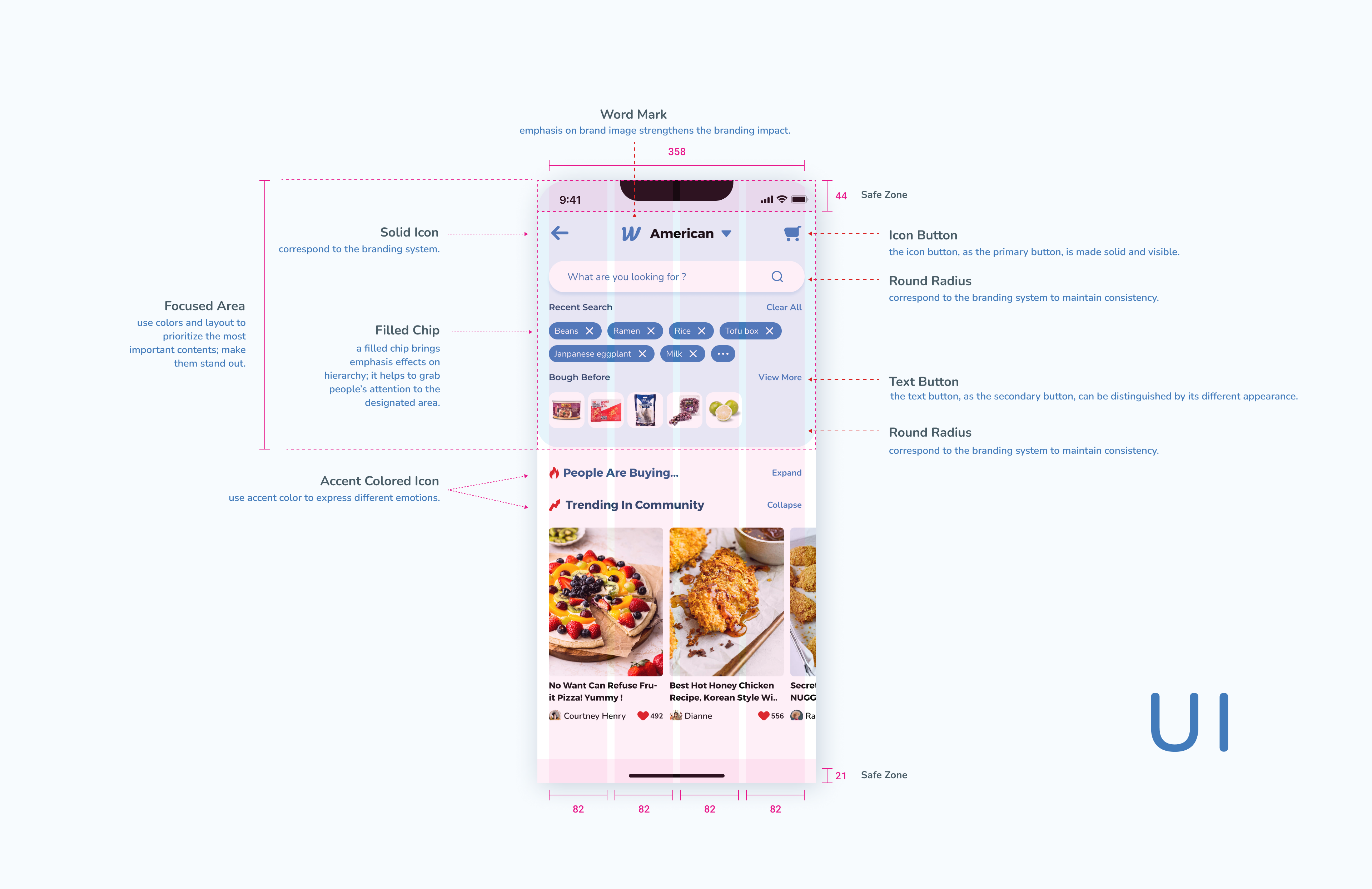
In UI design, I focus on creating a strong brand image with clear and simple interfaces. I prioritize hierarchy, readability, and accessibility to ensure users have a seamless experience. Consistency and aesthetics are key to maintaining a cohesive and visually pleasing design.

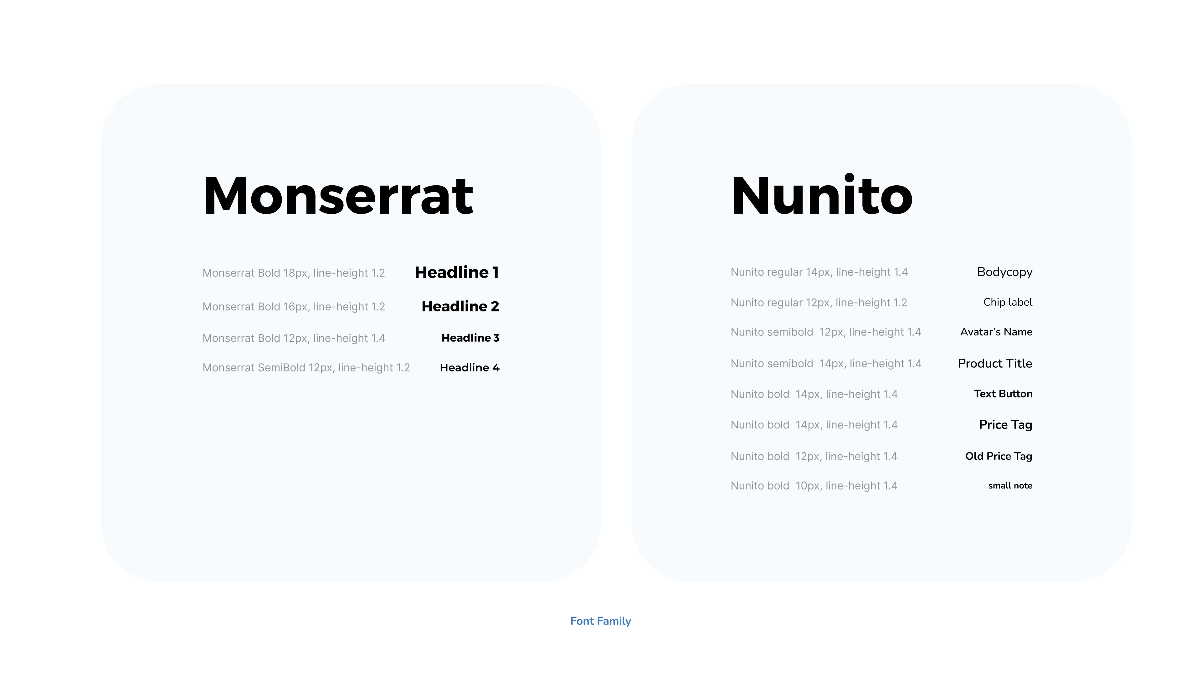
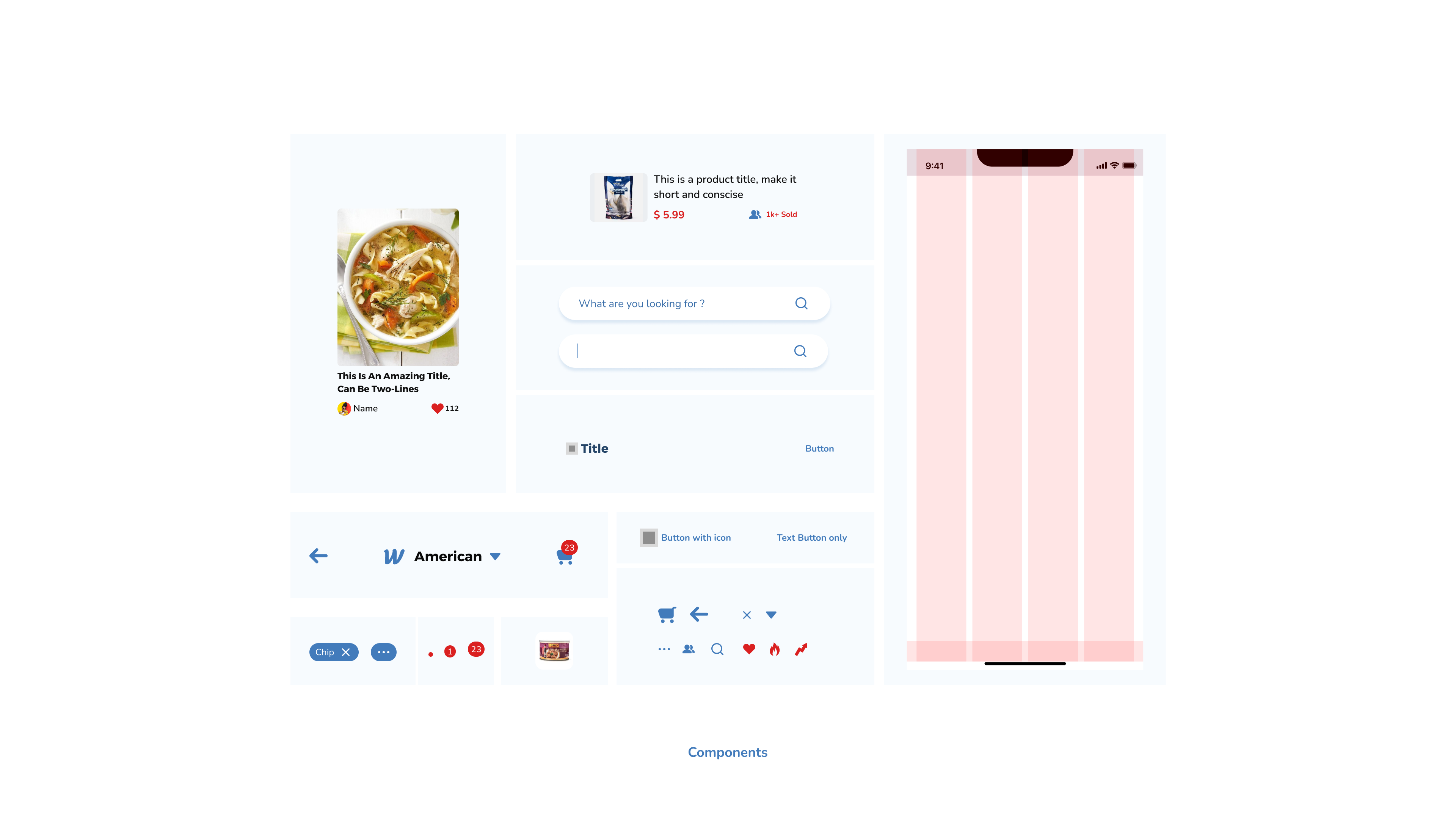
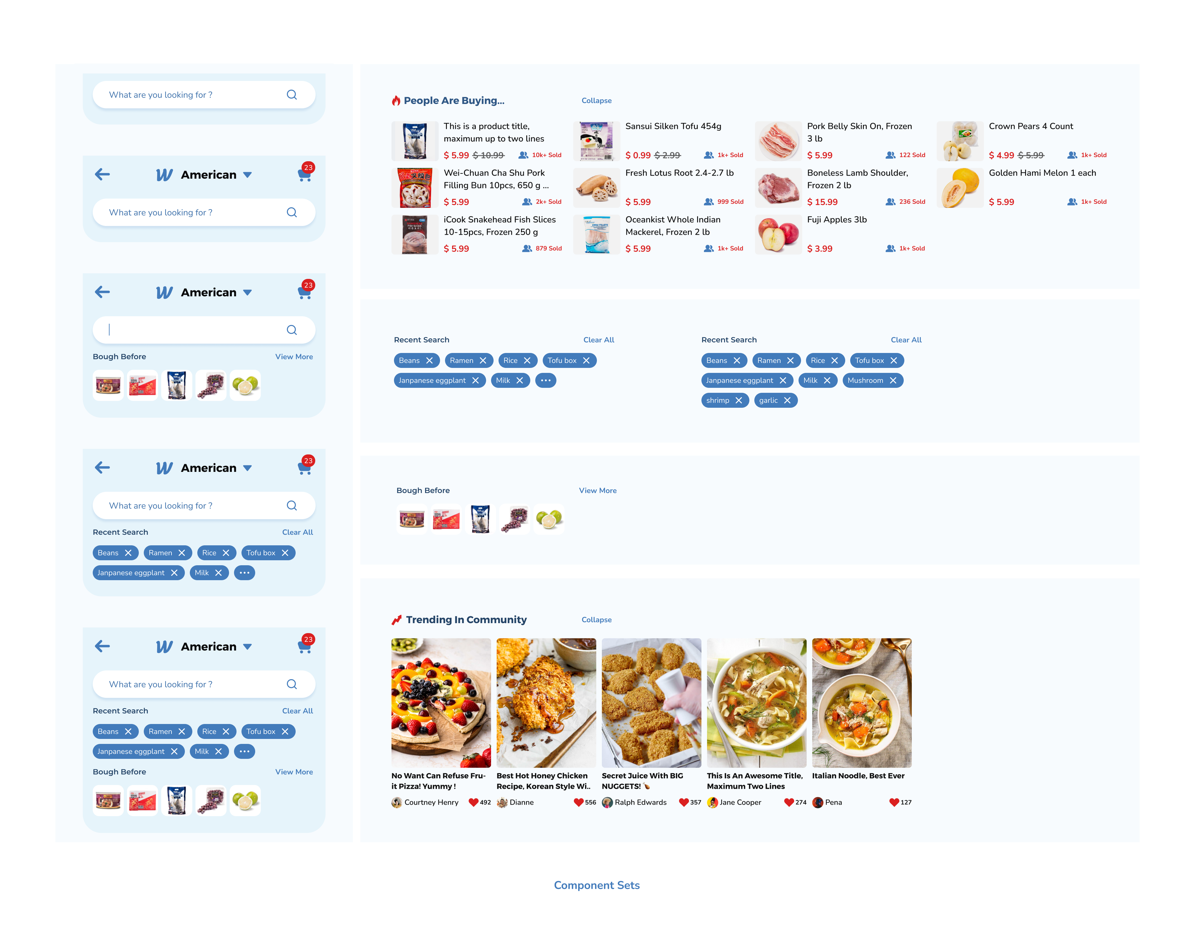
DESIGN SYSTEM
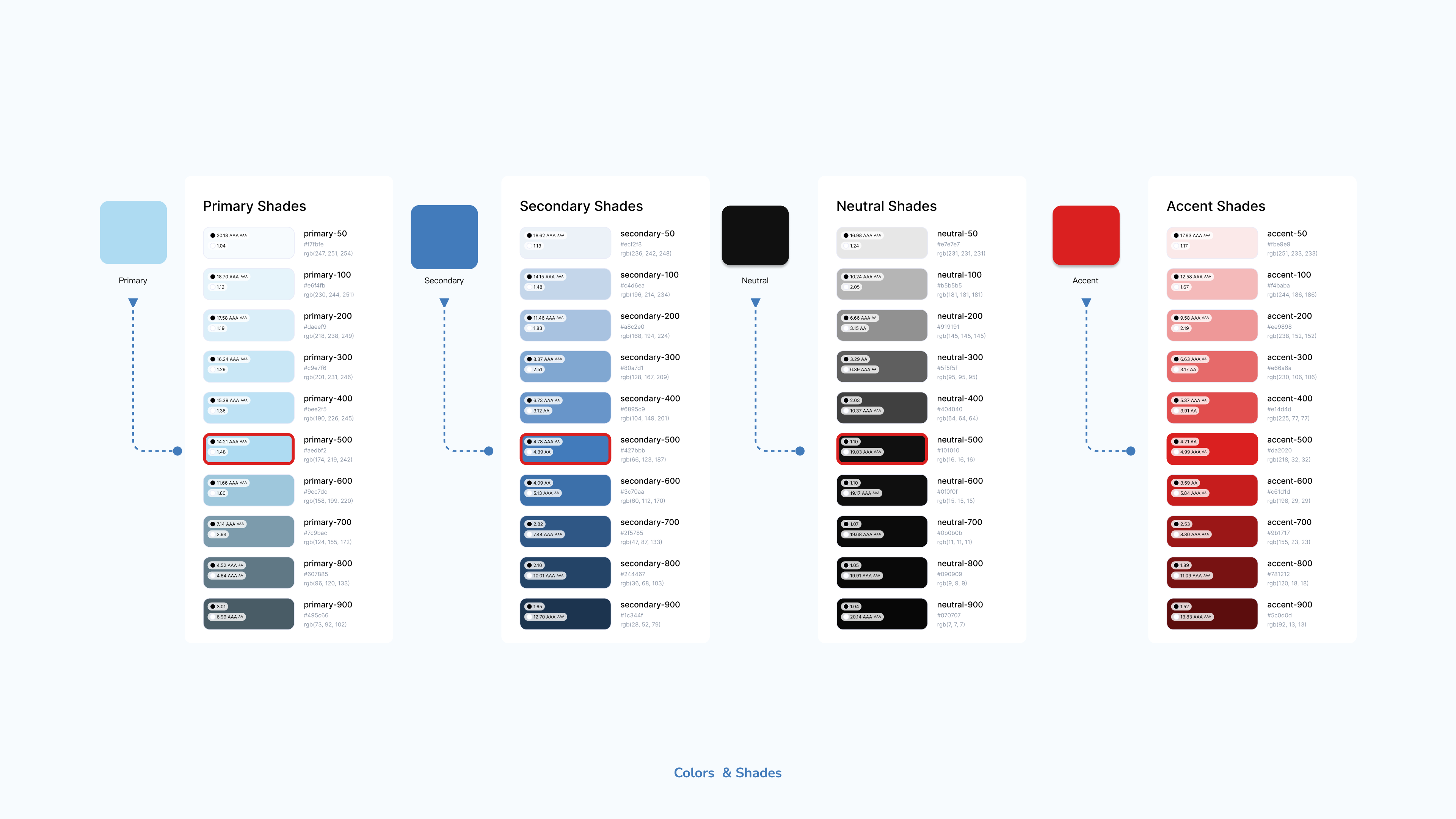
The benefits of a design system include improved efficiency, consistency across products, faster development, and easier maintenance. It serves as a central resource for design and development teams, fostering collaboration and ensuring a cohesive and polished user experience across various touchpoints.
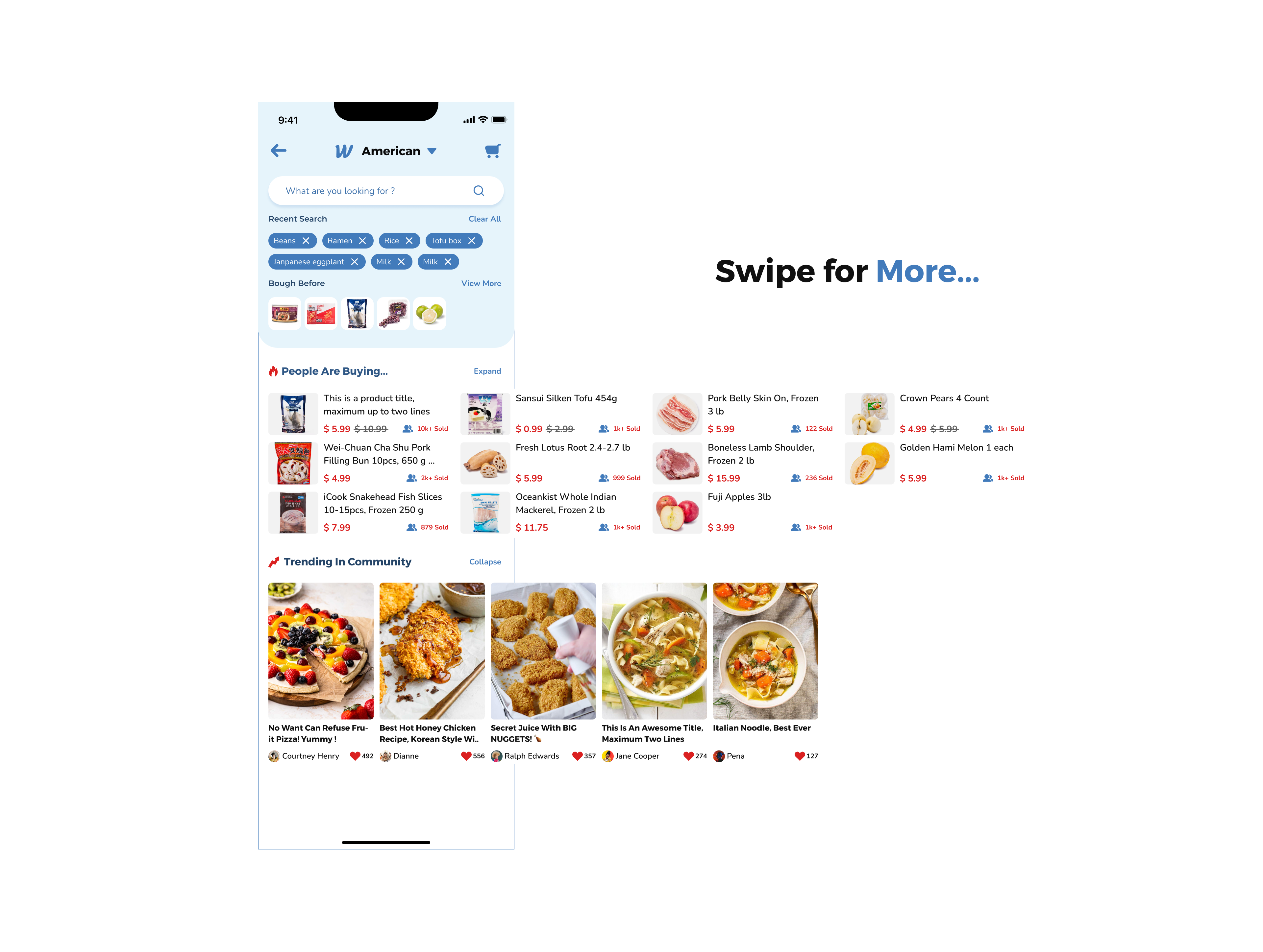
 Prototype